Taylor
Facilitating Travel for Abortion Services

Project Overview
Taylor was the result of a 2 day hackathon. Hackathon participants were tasked with creating a website or app that furthers/ helps a social cause.
The hackathon was in July 2022, only weeks after Roe V. Wade was overturned by the supreme court. I asked my group if they would be comfortable creating a resource for those effected by this ruling, and to my pleasant surprise, they all readily agreed.
Following research regarding currently available resources, we created Taylor - a website to facilitate abortion services, particularly for those who have to travel out of state due to new bans.
Role
UX/UI designer
Tools
Figma, Maze, Asana, Otter.ai, Canva, Slack, Zoom
Methodologies
User Research, Competitive Analysis, MSCW map, Sketching, Wireframing, Mid-fi Prototyping, Hi-Fi Prototyping, User Testing, Brand Design
My Task:
Create a mobile website developed from the need for facilitation of out of state travel for abortion services, an action made necessary for many by the reversal of Roe V Wade.
Research
Introductory Research

It's been about 50 years since Roe V Wade in 1973, described by Time Magazine as "in many ways ground zero for the tremendous gains women have made in the decades since."
As of June 24, 2022, the US Supreme Court officially reversed Roe v. Wade, declaring the constitutional right to abortion no longer exists.

Due to new legislations, many individuals now have to travel out of state or go travel a far distance from their homes for access to an abortion.

Competitor Research
There are currently websites available that offer information, resources, and scheduling, but we found that:

These sites are often oversaturated with information, which can be overwhelming to a person in an already stressful situation

These sites often have combative, urgent, and alarming conversational tones and colors that could be stressful to someone attempting to navigate these sites in a time of distress

No sites currently explicitly facilitate the planning of traveling out of state, an action made necessary for many by the overturn of Roe v. Wade
Design
Brainstorming site features
Product Elements
We began feature ideation with a list of possible features, and first categorized them using a MoSCoW map - organized by must have, should have, could have, and won't have, as well as by impact and effort.

Once we determined the features we wanted to move forward with (considering the chart as well as the time we had and scope of the project) we cut down and reprioritized the features. Our main focus was providing a confidential, comforting, and easy to use platform for users.

Design
Screens and sketches
Once the features were finalized, we created a flow for the project so that we could start breaking up the screens to create initial sketches.


Sample sketches:
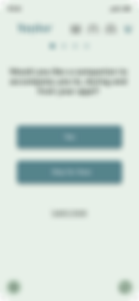
Companion Intro
Companion Gender
Choose your companion
Finalized Companion
Tab navigation system

Testing
Testing our first design iterations
Original wireframes


People were clicking the progress bar thinking it was a CTA.

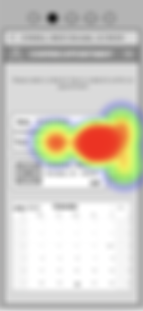
94.3% of users experienced 74% misclicks on the calendar page. A large majority of people thought the icons to the right were clickable.


New iterations
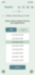
A teammate had designed the first iteration, but I took over the design from here. My first iteration of the new calendar is shown here.

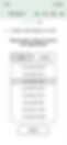

Following design discussions with the team, we realized scheduling an abortion appointment is an urgent need and would only be booking up to 2 months out, and only with certain appointment times would be available depending on the location. I opted for a scrolling selector with 2 month options to choose from.
Further testing resulted in further design iterations such as the following:
A redesign of the header / tab system.


Some users found it unclear that "continue" was a clickable CTA. I adjusted this by greying out the continue until at least one option had been selected, and then underlining it to show its click-ability.


Design
Creating a design system
Brand colors were kept simple, neutral and soothing intentionally avoiding adding any unnecessary stress. The name Taylor was chosen as it could be used in conversation/ discussed in a covert manner: "Have you met Taylor?" "I think Taylor could help."

Design
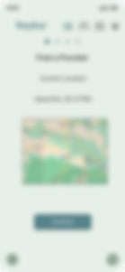
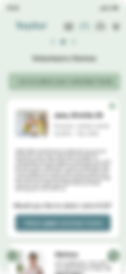
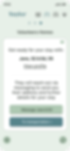
Take a look at the final product


Reflect
What would our next steps be?
-
Build out UI for Volunteers POV
-
Iterate on “Apply for financial aid”
-
Functional anonymous chat box
-
Conduct more research on differences of each state’s laws
-
Add an option to assign an appointment ID to each patient so that they can maintain their privacy